Vintage inspired but with an updated twist, this is a renovation after my own heart. Judge for yourselves after you read what Jen has to say about it.
In May, my husband, Jason, and I moved into a 1960s center-entrance colonial in rural Michigan. It was a far cry from the beautiful, detailed Minneapolis home that we moved from - built in 1920, our previous home had gorgeous wood floors, amazing built-ins, and nice, thick woodwork. Still, we fell in love with the land that our Michigan home was on. We're surrounded by rolling hills, and our house is situated in the middle of the woods. It's serene and peaceful outside our home... but inside? Not so much.
The first project that we tackled was our bathroom. At roughly 5' x 8', our bathroom is not big. Yet the previous owners had installed large cabinetry, opaque shower doors, and an oblong dusty pink toilet. Furthermore, a plastic shower surround was installed over old tile, the upper portions of the wall were covered in faded and dated floral wallpaper, and a dusty pink carpet was glued to the walls. YES. CARPET on the WALLS. Weird, right? Not to mention, it's a design choice that doesn't necessarily scream hygienic or stylish.
So we gutted it. In just a few hours, Jason and I had everything removed from the bathroom. We salvaged what we could and donated it to our local Habitat for Humanity ReStore.
Next, we called in back up. We found a carpenter that would work for us on an hourly basis. I knew the types of tile and bathroom fixtures that I wanted to install, and Jason and I wanted to be able to cut costs and satisfy our DIY urges by completing a lot of the work ourselves. Yet, we had a tight timeline and no knowledge of how to install bathroom fixtures or tile. In the end, I was able to watch and learn from the carpenter, and now I should be able to tackle other tiling projects in our house.
We chose a standard white cast-iron tub, and were surprised to find that we could buy it at the Home Depot and have it delivered the following day (the local plumbing store house told us it would be 3-4 weeks). Our carpenter, assisted by a plumber and two high school football players carried the 300-lb tub up the stairs. It was an event that I was happy to miss out on.
Our plumber also raised the height of the shower head (it originally came out of the wall at a height of 5'5"). We also had to hire an electrician to raise the height of the electrical box that supported the vanity lights (it also was located only about 5'5" height) and to install a new fan, a light switch for the vanity lights (they were previously turned on/off by a pull cord), and a few electrical outlets (am still trying to figure out how previous owners dried their hair without electrical outlets in the bathroom).

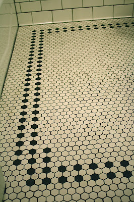
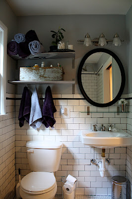
We chose to use black and white hexagonal tiles on the floor, and white subway tiles with black trim on the walls. We absolutely love the classic look of hex + subway tiles, and using white on the floor and walls makes the bathroom feel much bigger. We opted for dark grey grout to make the tiles really pop.
We chose a wall-mounted sink, standard toilet, light gray paint, and open shelves to finish out the room. The room is more open now and feels much bigger!

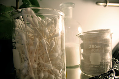
An antique toolbox to hold/hide our toiletries. Three hooks attach to the bottom shelf and our hand towels hang from them. Our bath towels are rolled and stacked on the top shelf, as well as a plant and three glass laboratory jars holding cotton swabs, cotton pads, and bath salts. Toilet paper is stacked inside an oversized glass vase.

We chose a standard white cast-iron tub, and were surprised to find that we could buy it at the Home Depot and have it delivered the following day (the local plumbing store house told us it would be 3-4 weeks). Our carpenter, assisted by a plumber and two high school football players carried the 300-lb tub up the stairs. It was an event that I was happy to miss out on.
Our plumber also raised the height of the shower head (it originally came out of the wall at a height of 5'5"). We also had to hire an electrician to raise the height of the electrical box that supported the vanity lights (it also was located only about 5'5" height) and to install a new fan, a light switch for the vanity lights (they were previously turned on/off by a pull cord), and a few electrical outlets (am still trying to figure out how previous owners dried their hair without electrical outlets in the bathroom).
We chose to use black and white hexagonal tiles on the floor, and white subway tiles with black trim on the walls. We absolutely love the classic look of hex + subway tiles, and using white on the floor and walls makes the bathroom feel much bigger. We opted for dark grey grout to make the tiles really pop.
We chose a wall-mounted sink, standard toilet, light gray paint, and open shelves to finish out the room. The room is more open now and feels much bigger!
An antique toolbox to hold/hide our toiletries. Three hooks attach to the bottom shelf and our hand towels hang from them. Our bath towels are rolled and stacked on the top shelf, as well as a plant and three glass laboratory jars holding cotton swabs, cotton pads, and bath salts. Toilet paper is stacked inside an oversized glass vase.
We chose a rain shower head and it's amazing. Our shower fixtures came from the plumbing store house, but I was thrilled to find matching sink fixtures on ebay for 1/3 retail. Thank you, ebay!
We're so happy with the final product! No more crazy carpet on the walls and the dusty pink has vanished!
My only regrets about the project are:
1. We did not seal the white unglazed ceramic hex tiles before using the dark grout. This resulted in a slight discoloration of some of the tiles. It doesn't look bad - but the tiles are not as white as they originally were. They have a slight gray haze to them, but at least it's relatively uniform across all of the tiles.
2. We should have purchased a silver/chrome pipes for under the sink. I naively assumed that the plumber would install silver/chrome pipes, but when he was finished and I went to check it out, there was the not-so-attractive plastic piping seen in the pictures above. Don't get me wrong - it's MUCH better than our pink before. But it could be prettier.
We still need to buy a shower curtain... I'd like to find something with a lot of texture in a light color. Like maybe some sort of light gray burlap curtain? I've also spied some white shower curtains with ruffles that I love, but the hubby was not as impressed with them (too girly?). If any of you have suggestions, I'd love to hear them! And feel free to stop by my blog {homeinthecountry} to check out all of the other updates we're making to our new home in the country.
Thanks Jen. Love this space and I think I might just have to steal that beaker storage idea. Very clever and chic. If you want to read more of what Jen has to say, hop over to Home in the Country.
The party is drawing to a close and I just have a couple more guests to introduce to you before I wrap it up. Grab a cocktail and stay a while.


Wow! Great transformation. Looks like it was a lot of work, but what a great sense of accomplishment to have it done.
ReplyDeletepk @ Room Remix
Looks amazing!!
ReplyDeleteOne comment - I follow your blog on google reader and it's almost impossible to read the posts when written in the blue-green colored text (because the background of google reader is white) - although I don't mind clicking the post to open your blog in a separate window...just thought you might want to know.
Being a Michigan native, I'm excited to go to your blog and check-out your work!
ReplyDeleteLOVE IT!
ReplyDeleteI've been reading this blog for a while, and while I usually love the content, I have to pipe up and say that I don't love your font color choice. I subscribe to it via Google reader, and while the font looks very nice against the gray background of the blog itself, it's impossible to read on the white background that most RSS feed's display on.
Most excellent - and fodder for my own upcoming bathroom renovation. I especially love the white subway tiles with the dark grout, and will take under advisement your advice re the unglazed hexagonal floor tiles (which I also love and was planning to use, or something similar).
ReplyDeleteWow, that was a horrendous before! I love the vintage look of your new bathroom. Since you're not crazy about the sink pipes, you could sew a skirt for the sink (even a mini-skirt version) to hide them. Tailoring the fabric and choosing a modern or very simple print (even a solid) would keep it from looking dated and "flouncy".
ReplyDeleteLord! That look like a big ole mess of a project! No thank you, I'll hire Mr. Watson from down the street to do it in exchange for some home cooking instead.
ReplyDeleteWhat a difference!! You might not be thrilled that your brand spankin' new hex tiles have the gray haze, but they just look more original to the home that way. Ours are and have that same hazy look.
ReplyDeleteYou must be thrilled each time you walk into the room. Fabulous selection of tiles...ENJOY!
ReplyDeleteJanell
Someone posted about spray painting white drain pipes on another site (can't remember which one). I think they used rubbed bronze but I'm sure you could use chrome.
ReplyDeleteLove the tile on the floor. Adds so much texture to the room.
ReplyDeleteKelly
http://tearinguphouses.blogspot.com
What a great reno. Ballard Design has a shower curtain that is white with black trim with a simple black initial on it- We have it in our smaller bath and it looks great. I love your floor. Thanks for sharing.
ReplyDeleteI like that she was able to recycle parts of her old bathroom for others to use.
ReplyDeleteSo much work but well worth the effort.
i LOVE those floor tiles. what a lovely, just LOVELY, room!
ReplyDeleteNice post - bathroom renovation pictures ..Keep Posting
ReplyDeleteRon
bathroom renovation pictures
I thought I had seen everything until the carpeting on the wall. Unbelievable!!
ReplyDeleteGreat job on the redo, and I think the pipes under the sink look fine. The white probably blends in better than chrome would?
Looks much better and very together, design-wise, but I alway ache for a little something unexpected,and a small touch of color, though,
ReplyDeletelike a vase of feathers, old doll holding a toothbrush or a vintage hat....???
I am chosing the same black and white hex tile for my bathroom floor. Did you go with a matte finish or a gloss? Any thoughts between the two would be appreciated!
ReplyDeleteThis is my first time seeing these images of your bathroom remodel. I love the tile selection and pattern. Classic look, perfect for your home.
ReplyDeletexo,
cristin
What a great renovation work!Tile selection and pattern is really good.Your bathroom looks really amazing.Thanks for sharing this blog.
ReplyDeleteWhat a great renovation work!Tile selection and pattern is really good.Your bathroom looks really amazing.Thanks for sharing this blog.
ReplyDelete